Not Until You Finish Your Plato Full of Vegetables
Published April 1, 2024
My House, Dallas, Texas
Anyone who tells you that studying philosophy is waste of time and will likely have no application in the real world, well, that person has clearly never been tasked with trying to figure out what photographs to use for Website Buttons.
Yep, I’m about to talk about Plato’s Theory of Forms, as well as the metaphysical Problem of Universals, as this is what I found myself re-reading when I got my panties all twisted up in knots over what exactly I needed to photograph to use for the COVINGTON'S NURSERY WEBSITE buttons. You didn’t seriously think I was just going to talk about the best way to photograph vegetables, now did you?
Before ever picking up my camera, I found myself needing to determine the true essence of a thing or concept, in order to know how to succinctly communicate those complex ideas (or an entire category of ideas) in a single, quickly identifiable, picture. To put it more simply, what is the absolute perfect picture to get a majority of people (website users) to look at the photograph you’ve taken and instantly think of the exact words you intended for them to think of in their minds? For example, what is the perfect image to get people to think of “Vegetable Gardening?” This directly involves everything that Plato was talking about all those many years ago.
When learning about Plato’s Theory of Forms and Universal Truths in college, I didn’t think of it being applicable to web design at the time, instead, I immediately imagined that it was probably a real life dilemma faced most frequently by the folks who make up foreign language flash cards.
Let’s say you need to learn the work “chair” in Spanish. What exactly are you going to put on that flash card? I think most of us can probably agree that using a picture of a stool or chaise lounge would be interpreting “chair” too liberally, but even using a chair such as a wingback or a recliner might encourage people to think they’re learning the word for a very particular type of chair rather than the universal archetype.
So what does the universal, quintessential representation of “chair” actually look like? This is the challenge I set myself for every single button on our Covington’s website: to try and determine the most universal depiction of the thing or concept I was trying to convey. In other words, if my button was a flash card, and I held it up to someone, could I get them to instantly yell out the exact name of my button?
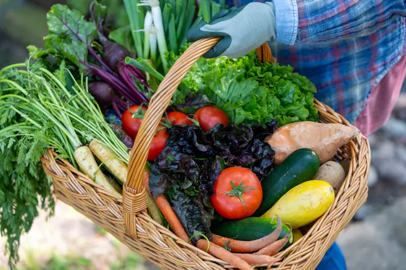
Let’s start with this photograph of vegetables, for example. It took a long time to arrive at this particular image as a representation of “Vegetable Gardening.”
See, if I were to show just one type of vegetable, let’s say onions, for example, how would people know that the onions were intended to represent a greater whole— vegetables in general— as opposed to just taking it at face value and thinking, this is a button about Onions. Maybe different types of onions will be explored, but just onions, nonetheless.
So we needed a photo that was less representative, and more literal, to communicate, “This is about all the vegetables.” Now, the end goal is probable to eat them, yes, but if I were to photograph a bunch of vegetables already prepared and on a table, that photo would likely conjure up words such as “Recipes” or “Dinner” in people’s minds, not the word “Gardening.”
Similarly, if I were to show a photo of a bunch of vegetables, growing in a lovely, raised garden bed, that might lead people to start thinking more about the structural apparatus that the vegetables are growing in, and less about the vegetables themselves.
Alternately, a photo of a bunch of seed packets is too specific and limiting, as that’s not how most people plant their vegetables nowadays. Likewise, a bunch of vegetable plants in four-inch plastic containers (which is how most people do prefer to plant their veggies) might indicate that it’s a button for purchasing exactly that— vegetables in four-inch containers. Which is not what we want either, we want the category to be much more inclusive.
However, in this instance, that’s secondary to the problem of getting such a photo to make people recognize that those are vegetable plants in the first place; plants that small aren’t likely to have any actual vegetables on them yet. So, you run the risk of not being able to tell what kind of plant they are at all. Also, let’s be honest, conceptually that would just be a lackluster and visually uninteresting photo. That’s always at the back of any photographer’s mind, that while communicating what is necessary, how can we also make sure that the photograph is beautiful on a visceral level?
Next, it was helpful to consider that “gardening” is a verb, and implies action, specifically, the action of a human being. Therefore, it was important have a person in the photo, but not one that is too prominent or distracts the eye from the vegetable harvest. It’s why this particular photo below was ultimately voted down and relegated to the sub-button of “Vegetables” within the larger category of “Vegetable Gardening.”
It’s a visually great photo and just as technically proficient as the one with the veggies in a basket, yes, but there’s no human being present, and so it just makes you think of farm fresh vegetables, am I right? And not the act of actually growing them.
Which, by the way, is another near impossible thing to photograph or communicate in a single photo— the act of a plant actively “growing.” On a side note, other things that are near impossible to capture photographically are non-visual stimuli such as smells, or lofty concepts like when people all pay small amounts collectively to benefit the greater needs of the whole. This is why both Fragrance Commercials and Insurance Commercials are consistently afforded such broad artistic freedoms, and amongst the most creative and experimental of all ads on television. The things they are selling have no universal (or even visual) representation associated with them.
Even after deciding that my photo of a woman carrying a basket of freshly harvested vegetables would be the photo I used, in the end I ended up changing the name of the button entirely. The reason is admittedly a bit pedantic: Since tomatoes are the most popular edible plant that we sell at Covington's, I thought I could include them in the basket and live with myself, even though they are technically, botanically, fruits; but alas, I could not. It’s why I changed the name of the Button to “Edibles,” instead of my original “Vegetable Gardening.”
With the new category being called “Edibles,” do we now run the risk of some people thinking they are going to look at marijuana products? Sure. But I figure if individuals are so high that they can’t pick up on the context clues of the word “Edibles” when it’s paired with a basket of vegetables, then they are probably high enough to forget what they were originally searching for in the first place, and be happy to just look instead at some vegetable listings for a bit.
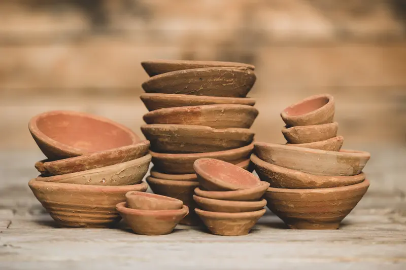
Sometimes, my considerations were even more cerebral, like in the case of pottery. I was afraid that if I chose any pottery that was too indicative of one particular style of home decor, that it might be off-putting or misleading to people who don’t care for that style. I went instead with this photo that hopefully just conjures up the thought of “pottery” as a vague concept, and not a definitive type or style.
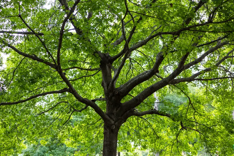
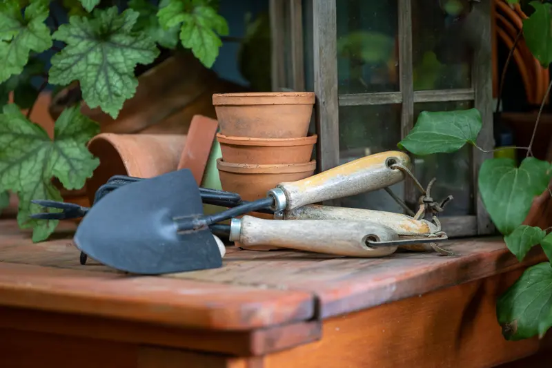
It’s true, depending on what it I was trying to depict, these buttons presented varying degrees of difficulty. For example, what to photograph and use for “Trees” was relatively easy, as was deciding what to photograph for “Tools.”
Some of the harder ones include a sprawling idea such as “Accessories,” and the hardest one of all, “Gifts.” The instant the gift item you are photographing has any sort of set function or practical utility, it runs the risk of representing that category of things too concretely. Therefore, for photographic purposes, I ended up boiling down the essence of a “gift” into an item that possesses two inherent properties simultaneously: a gift is something pretty to look at, but that has no real purpose.
(I feel like those parameters could also describe several of my ex-boyfriends, ha-ha. And contrary to what they may have believed, most of them were anything but gifts…)
Here's a "Gifts Button" photo that went in the discard pile, namely because the majority of "gifts" depicted here are houseplants, and that has its own separate button.
I eventually settled on this photo of watering cans:
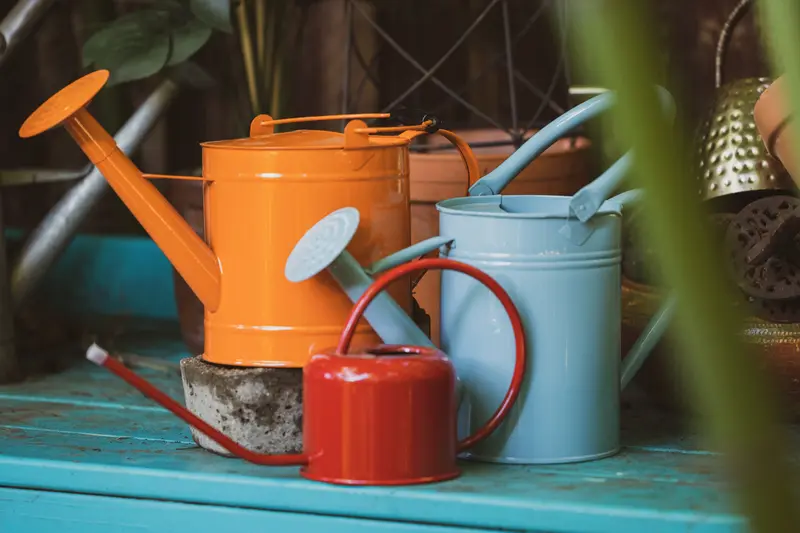
I know what you're thinking, and I don't want to hear it. I know you’re thinking, “But Ryan, watering cans most definitely serve a function!”
Do they though? I feel like, if we are being totally honest, the function that they serve is not the one for which they were originally intended. Antique watering cans are lovely, I agree, but only so long as we all acknowledge that their main purpose is to be photographed, not used.
Don’t get me wrong, I have them everywhere around my yard, but they certainly aren't for watering. That would take forever. I mean, if people want to assume that I quaintly collect water from one location, put it in a tiny decorative vessel just so I can slosh it to a different location, then repeat this hundreds of times all around the yard, then let them. But that's preposterous, a fairytale version of gardening, and of course in actuality, I have everything on drip.
Yep, I'm prepared to fight people on this one, watering cans are gifts, goddammit!
However, what I will concede is that if a watering can showed up on a flash card, I'd probably have more people yelling out the word "watering" than I would the word "gifts." Maybe that's why buying gifts is so hard -- because we have no agreed upon Platonian Ideal or Universal Concept of what a gift actually is! Did you ever think about that? Huh? See, I'm ready to fight.
But ugh, I'm tired of talking about Plato for today, so... Class Dismissed!
You can read more about the Drip Irrigation in my yard HERE, though.